The Power of Visual Hierarchy in Direct Marketing Creative
If your customer or prospect opens your letter or email — Bravo! You’ve cleared the biggest hurdle. But don’t celebrate yet. Now you have to keep your audience with you. If they open your communication to a dizzying array of words and images, their eyes will find no traction on the page and slide right off. You’ll lose them.
The real celebration belongs to businesses whose creative teams understand the importance of visual hierarchy to keep readers engaged until the moment they make an informed response.
Work With The Brain, Not Against It
The term “visual hierarchy” has its origin in Gestalt psychological theory, which says the human brain innately organizes elements, shapes or forms into a coherent whole, and those elements that disconnect from the whole stand out.
In graphic design, visual hierarchy is the selection and showcasing of elements to influence the order in which the human eye perceives what it sees. In other words, key points of your message can draw attention by being different in shape, color, or size. Artful handling of these elements avoids confusion and strengthens your message. More importantly, it keeps your reader from giving up.
Creative pros with expertise in direct marketing help your readers see and comprehend your offer in an efficient, effortless way.
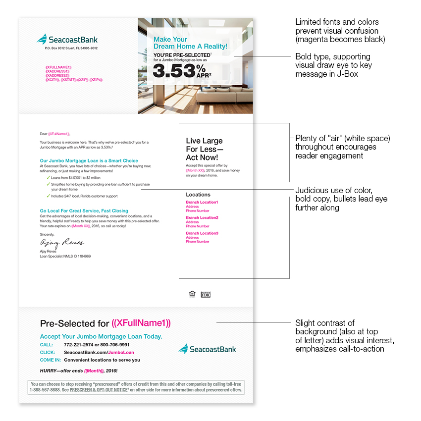
It’s a beautiful thing. In the example below, notice how purposeful design steers the eye across the page and compelling copy keeps you reading.

The Alternative Isn’t Pretty (Or Effective)
Chaos is easy to create. Just throw in everything you can possibly think of and use lots of emphasis everywhere all the time. Voila!
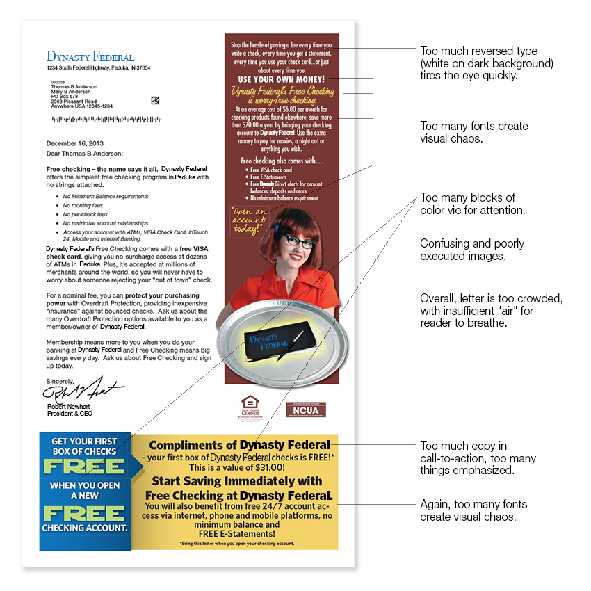
We’ve all opened our mailboxes to find a loud, crowded letter like this one:

This letter almost guarantees that the reader will disengage within seconds. Worse — she could brand the institution as having wasted her time. The last thing you want to do is frustrate a captive audience. That frustration has a long shelf life.
Remember: A prospect will not search your communication for meaning and value. These must reach out from the page and take her by the hand.
Visual Hierarchy Unites Copy and Layout
Most people skim or scan a letter first for the high points — which visual hierarchy helps them find. If they like what they see in a first scan, they read deeper, where every word must pull its weight to address the what, why, how (and now!).
You can see in the first example how art direction commands the visual hierarchy, which in turn showcases the offer. While design skills steer eyes across the page, compelling copy keeps your prospect reading. Proof point by proof point. All the way to the call-to-action.
Same Principles Apply to Email
While other elements affect how prospects read and comprehend email (such as scrolling and the screen’s light), visual hierarchy is equally important.
Make sure easy-to-see response buttons and links are:
- Above the fold (before reader must scroll down)
- An inherent part of scannable bullets
- Presented again in your final call-to-action (in a sidebar or at the end of the email)
The Right Thing to Do
When prospects and customers take the time to open your marketing piece, they deserve star treatment. Visual hierarchy is the chauffeured limousine that drives your audience to different parts of your message, where they can take a picture or get out for a closer look.
This best practice saves your audience time and helps them make an informed decision. It’s strategic, it’s thoughtful, and it works.


